
Meet the Flexbox Inspector
Flexbox just got a whole lot easier to work with.
CSS Grid is the new kid on the block, bringing with it many shiny new tools that make layout on the web easier. But we still need Flexbox. There are many layouts you can only accomplish with Flexbox. Mastering it will do a lot for you as a web dev. The real magic comes from knowing both Grid and Flexbox like the back of your hand. But working with Flexbox hasn't been easy.
The Flexbox Pit of Despair
So many variables go into the final Flexbox layout calculation: the size of the flex parent container, the flex-direction orientation, items' starting flex-basis, their flex-grow and flex-shrink ratios, whether or not you're using flex-wrap etc. An expert level understanding of Flexbox was required to know how elements in the layout ended up where they did.
When CSS Grid entered the scene, one could argue that it's a simpler layout tool. For many layouts that's true, but Grid has its own complexity and set of variables and mechanisms to learn: implicit tracks, the complex grid item placement algorithm, named grid lines, auto-flow, gaps, etc. What made Grid more approachable wasn't just the tech, but also the Grid DevTools that Mozilla shipped for working with it. That tool is what convinced me to switch to using Firefox for layout. But Flexbox was still a black box... until now.
New Flexbox DevTools
The good news is Firefox massively improved the Flexbox development experience with some brand new DevTools. Here are some of the helpful things it gives you:
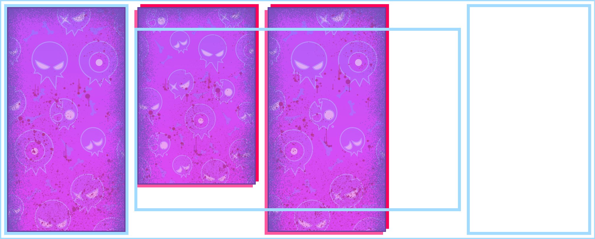
Flexbox Highlighter
You can overlay a highlighter to see the flex container and its flex items. Here's my blog header that uses Flexbox, with the DevTools highlighter showing its structure:

Flex Item Tool
The hardest part about working with Flexbox is trying to grok how flex items end up having the final size that they do. Items' content size, width, min-width, max-width, flex-basis, grow and shrink settings all play a part. The complete formula is very much worth learning. But the new Flexbox Inspector takes the guesswork out of it, showing you exactly the size an item starts out at, its final size, and how it got there.
Here's a goo zombie in Flexbox Zombies that grows as the flex container grows. And now the new DevTools shows us exactly what's happening! This little goo zombie starts out at 136px but gains +272px because of its flex-grow: 1 setting, giving it a final size of 408px when the container is fully expanded. Having this level of insight into Flexbox feels like cheating!
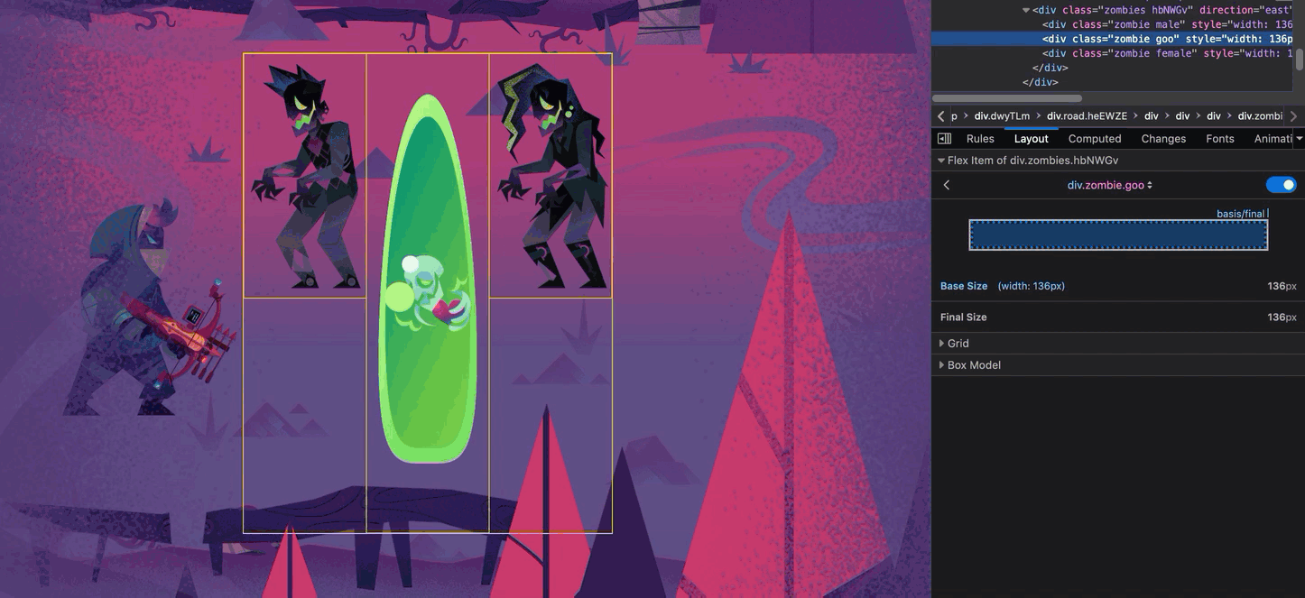
Shoutout to Victoria Wang, who designed the Flexbox Inspector, for figuring out an incredibly clean way to present this helpful info.
And More
The DevTools team is working on even more Flexbox features to help out while you code your Flexbox layout. Huge thanks to those awesome folks for working so hard to make our CSS lives easier!
Practice with the DevTools Challenges!
I wish this had been available when I was first learning Flexbox! To celebrate the existence of such a fantastic new tool, I've created a handful of challenges you can try to solve using nothing but the DevTools:
challenge 1
display: flexandflex-directionchallenge 2
justify-contentchallenge 3
align-itemschallenge 4
align-selfchallenge 5
flex-growchallenge 6
flex-shrinkchallenge 7
flex-basischallenge 8
orderchallenge 9
flex-wrapchallenge 10
align-contentchallenge 11
flex shorthand
Each challenge corresponds to what you can learn in a chapter of Flexbox Zombies, a free Flexbox Mastery Game. So if you get stuck, go play the game to learn what you're missing, then come back and solve the challenge.
Happy hunting!
Flexbox is incredibly powerful. But it's also crazy hard to master. So we all end up depending on a cheat sheet and guessing in the dev tools. Enough of that! Time to master it once and for all, in a way that actually sticks, so you can build any layout you can imagine with flexbox.Master Flexbox