
Naming Your CSS Grid Lines
CSS Grid is crazy powerful and bring us lot of awesome new tools. One of the coolest new things we get is the ability to name our grid lines. But why you'd want to name them and the syntax for doing so can be a bit confusing.
What Can You Do With Named Grid Lines?
Naming grid lines gives you hooks into your grid where you can attach your content. Let's take a look at naming some vertical lines with the grid-template-columns property. We'll call our outer lines outer-start and outer-end, and name the middle two lines center-start and center-end.
.container {
  grid-template-columns: [outer-start] 1fr [center-start] 1fr [center-end] 1fr [outer-end];
}
Once they lines are named we're able to attach content to them using the grid-columns property. In this example we're telling the purple item to start at the outer-start line and end at the outer-end line.
.container {
  display: grid;
  grid-template-columns: [outer-start] 1fr
                         [center-start] 1fr
                         [center-end] 1fr [outer-end];
  grid-template-rows: 1fr 1fr;
}

.purple {
  grid-column: outer-start / outer-end;
}

.orange {
  grid-column: center-start / center-end;
}
Orange is doing the same thing except with the center lines.
Once you've named your lines, you can use these names to position and size your grid items! Here we're telling the grey item to start at the outer-start line, and go until the center-end line. Blue is starting at center-start and ending at the outer-end line.
.container {
  display: grid;
  grid-template-columns: [outer-start] 1fr
                         [center-start] 1fr
                         [center-end] 1fr [outer-end];
  grid-template-rows: 1fr 1fr;
}

.grey {
  grid-column: outer-start / center-end;
}

.blue {
  grid-column: center-start / outer-end;
}
You can name your horizontal grid lines as well using grid-template-rows. This lets you use named lines to position/size your grid items vertically. In this example we tell the blue item to attach to the center vertical lines, to start at the top horizontal line and go all the way to the bottom horizontal line.
.container {
  display: grid;
  grid-template-columns:
    [outer-start] 1fr
    [center-start] 1fr
    [center-end] 1fr
    [outer-end];
  grid-template-rows: [top] 1fr 1fr 1fr [bottom];
}

.blue {
  grid-column: center-start / center-end;
  grid-row: top / bottom;
}
Once you get the hang of it, handling positioning and sizing with named grid lines is a snap.
But That Syntax Tho
The syntax for naming grid lines can seem confusing at first. I've found that it helps tremendously to think of the syntax like this:
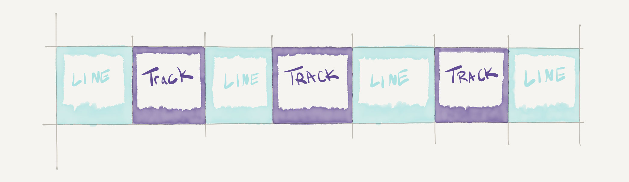
Where a track is a column or a row, and the lines are optional. The confusion comes in because we're actually doing two things in a single line:
- Naming our lines (not our tracks)
- Sizing our tracks (columns or rows)
So going back to our very first example where we named the outer and center lines:
.container {
  grid-template-columns: [outer-start] 1fr [center-start] 1fr [center-end] 1fr [outer-end];
}
We can think of that syntax like this:
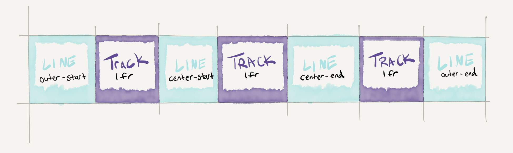
Think of it as line, track, line, track, etc. It always starts with a line and ends with a line.
It's also important to remember that line names are surrounded by brackets [] only when they're defined, not when they're used to attach items to them.
Names are Optional
Say we didn't want to name the outer lines anymore but just want to give the center lines names:
.container {
  grid-template-columns: 1fr [center-start] 1fr [center-end] 1fr;
}
We can think of it the same way:
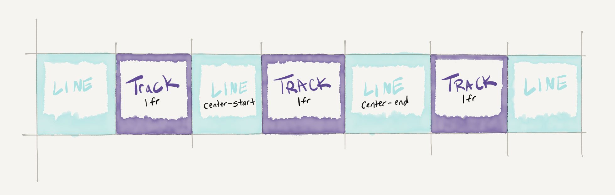
We just didn't name the outer lines this time. It's still helpful to remember that the lines are there even if we didn't give them names.
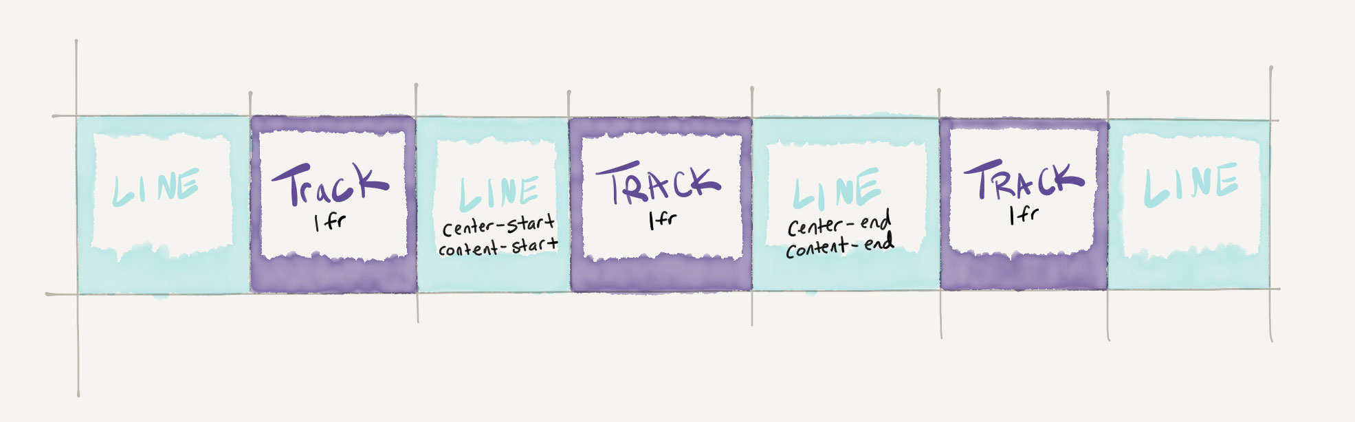
Multiple Names
Just as a heads up, you can give grid lines as many names as you want. This is helpful since lines sit between two different tracks and border on grid areas which we'll get to in another post. The syntax for multiple names is just a space between the names inside of the bracket:
.container {
  grid-template-columns: 1fr [center-start content-start] 1fr [center-end content-end] 1fr;
}
Automatic Names
There's a tiny little robot inside of each browser that automatically names your grid lines for you - even if you've already named them yourself! It starts at 1 and adds a numeric name to each line, in order. So our example above would actually end up with these names:
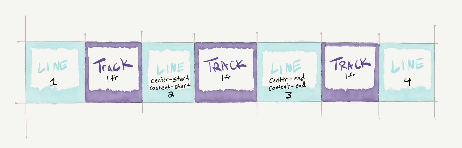
We can even use these automatic names for positioning:
.container {
  display: grid;
  grid-template-columns:
    1fr [center-start] 1fr [center-end] 1fr;
  grid-template-rows: 1fr 1fr;
}

.purple {
  grid-column: 1 / 4;
}

.orange {
  grid-column: 2 / 3;
}
But it's usually a better practice to give your lines meaningful names rather than using the automatic numbers, since the numbers will change when you change your grid.
And that's it! To get some solid practice and commit this stuff to memory join us in Grid Critters. Once you get the hang of the syntax you'll be able to size and position any grid items using this awesome new technique.
Master CSS Grid right from the start by playing this new mastery game. You'll learn the ins and outs of Grids one fun level at a time, while saving an adorable alien life form from certain destruction.Master CSS Grid