
CSS Grid Track Options
CSS Grid is hands down the best way to build the majority of layouts today. But how should you define your Grid's tracks (rows & columns)? What about gaps? You've got a lot of options and units to choose from. When should you use what? Let's take a look!
Jump to:
- fr
- %
- px
- ch
- ex
- auto
- none
- min-content
- max-content
- rem
- em
- vh, vw, vmin, vmax (viewport units)
- minmax(min, max)
- repeat
fr
The fr unit is the one of the new goodies that came with CSS Grid and is my absolute favorite. You can think of fr as parts like in baking. One part flour, three parts sugar. This awesome new unit make responsive layouts easy.
Here's a grid with three columns, where the middle column is twice as big as the outer columns:
.container {
  display: grid;
  grid-template-columns: 1fr 2fr 1fr;
}
Play around with those fr ratios above and see how the columns change!
All of the options in this post work for both columns and rows, fr included. Here's an grid that uses fr based rows:
.container {
  display: grid;
  grid-template-rows: 1fr 2fr 3fr;
}
fr tracks are fractions of any remaining space after fixed units like px and after any gaps have had their say.
In this grid the 1fr row's height will be anything left after the 200px row and the 20px gap:
.container {
  display: grid;
  grid-template-rows: 200px 1fr;
  grid-row-gap: 20px;
}
when to use fr
Make fr your default dynamic unit. Use it for tracks that should "take up the rest of the space". Use it for ratio-based layouts like letting two columns split the remaining space after a sidebar. Prefer it over the % unit most of the time as fr accounts for gaps' sizes (see below).
fr example
For Service Workies I'm using this simple grid:
.shell {
  display: grid;
  grid-template-columns: 80px 1fr;
}
This produces a fixed 80px sidebar and (thanks to fr) a fluid content area that occupies the rest of the space:

percent (%)
Percent columns are based on the width of the grid container. Percent rows are based on the height of the grid container.
.container {
  display: grid;
  grid-template-columns: 50% 50%;
  grid-template-rows: 50% 50%;
}
what's wrong with % tracks?
Percentages are based on the grid container size, so they don't care what else is going on in the grid. Watch how adding a small gap causes our grid container to overflow:
.container {
  display: grid;
  grid-gap: 20px;
  grid-template-columns: 50% 50%;
  grid-template-rows: 50% 50%;
}
Whereas fr is a fraction of the free space (after gaps etc). Here's this same layout but with fr tracks instead of %:
.container {
  display: grid;
  grid-gap: 20px;
  grid-template-columns: 1fr 1fr;
  grid-template-rows: 1fr 1fr;
}
Look Ma, no overflow scrollbars!
when to use %
So while fr is preferrable much of the time, there are certain cases where % makes sense. Use % when you want to guarantee that a track be a certain percentage of the grid container, no matter what. Just don't make all your tracks %, or you won't be able to take advantage of gaps (without causing overflow like we've seen). % can also make for good gap sizes, where fr cannot be used for gaps.
px
Ahh the good ol' pixel. It's a single dot of your users' conceptual screen resolution. px (fixed) are often combined with fr (dynamic) tracks to create fluid layouts.
.container {
  display: grid;
  grid-template-columns: 100px 1fr;
  grid-column-gap: 5%;
}
when to use px
Use px whenever you need a fixed size track, such as a menu sidebar. Just be aware that if you use px for all your tracks, your layout won't be very responsive.
px example
In the Grid Critters conversation screen I used this grid:
  .techpanel {
    display: grid;
    grid-template-rows: 40px 1fr 40px;
    grid-template-columns: 1fr;
  }
to layout this futuristic chat panel:

ch
The ch unit equates to the width of the number 0 (zero) of the grid container's current font. It will be bigger or smaller depending on the font family used. While this sounds like a wacky unit of measurement, it's actually quite useful.
I'll take the borders off this example so you can see how the 1ch column is the same width as the number 0 inside it:
.container {
  display: grid;
  grid-template-columns: 1ch 1fr;
  grid-column-gap: 1ch;
  font-size: 75px;
}
Try bumping this example's font-size to 150px and watch the 0, the gap, and the column all grow wider.
when to use ch
Use ch anytime you want a track or gap whose size depends on the font-size. It can be useful for large magazine-style typograhic titles.
It can also be used to limit the width columns of text, making them more readable.
ch example
The text you're reading right now is inside of a grid column that's limited to 57ch wide. You can read more about that technique in Article Layout with CSS Grid.
ex
The ex unit is just like ch except it's based on the height of the current font's lower case x. In my 15 years of web dev I haven't yet had a need for this one. If you've found a good use case for it let me know and I'll add it here.
auto
Auto simply means the size of the grid items' content. Setting a column to size auto means to set it to its items' width. Setting a row to auto means to set it to its item's height.
.container {
  display: grid;
  grid-template-columns: auto auto;
  grid-column-gap: 20px;
}
Try this. Change the example above's text by selecting it with your devtools. Now switch to the devtools console and type document.designMode = "on" then hit enter. Now click anywhere in the text and type whatever. You'll see the grid column size change to match the width of the text. Neat!
One thing to note about auto columns is that they're lower in priority than other track options. A column set to auto will only be its full text size if there's room. Otherwise it will cause the text to wrap to multiple lines. Make your browser window narrower to see that effect.
There are a bunch of other details with auto tracks like how extra space is distributed, that we can't cover here but that you can master in the Grid Critters game.
when to use auto
Use auto when you want to make your grid track match the size of content inside of it. This works for text, images, SVG, canvas elements, etc.
auto example
On the grid critters landing page I used auto like so:
  .site {
    display: grid;
    grid-template-columns: auto auto;
    grid-column-gap: 2rem;
    justify-content: center;
  }
This simple centered grid holds these fun chapter cards:
BTW fun borders like this are easy to make with dynamic SVG.
These chapter cards vary in size depending on screen size, and my grid columns always match their width thanks to auto.
auto also happens to be the default track setting for all implicit grid tracks (tracks that appear automatically whenever there's not room in a grid for all the content it holds). So if you've ever had stuff in a grid and didn't specify any row or column sizes, then you were using auto without knowing it!
none
When a column or row is set to none it means no explicit tracks. You'll still get implicit tracks if there's any grid items in the track.
Here's a grid that uses none to declare no explicit rows, but since there are four items in the grid we get two implicit rows showing up. We can style implicit rows using the grid-auto-rows property.
.container {
  display: grid;
  grid-gap: 20px;
  grid-template-columns: 1fr 1fr;
  grid-template-rows: none;
  grid-auto-rows: 1fr;
}
when to use none
none is the default for rows and columns if you don't specify them. Use none mainly when you want to reset/override a grid that was defined earlier, for example in a media query breakpoint. It's not used very often but is still good to understand.
min-content
The min-content option tells the track to take up as little space as possible while still avoiding overflow for any of the grid items in that row or column.
.container {
  display: grid;
  grid-template-columns: min-content 1fr;
  grid-template-rows: 1fr 1fr;
  grid-gap: 20px;
}

.item {
  /* you'll never believe what happens next... */
  /*white-space: nowrap; */
}
The min-content column is nice and narrow, and causes the text to wrap as much as possible. Comment in the white-space: nowrap; rule to force the text to not wrap, and watch that column widen automatically. Like Granny always said, If there's one thing a Grid hates it's overflow!
when to use min-content
Use min-content mainly when you want to instruct a track to cause any text inside it to wrap. It can also be a useful value when paired with minmax().
max-content
max-content is just like min-content except it instructs the track to take up as much space as possible. It's almost like the track puts white-space: nowrap; on all of its items.
.container {
  display: grid;
  grid-template-columns: max-content 1fr;
  grid-template-rows: 1fr 1fr;
  grid-gap: 20px;
}
when to use max-content
Use max-content when you don't want a track's contents to wrap, or when you want the size of a certain piece of content (text/image/etc) to determine the size of the track.
rem
The rem unit is one of my favorite options. It sizes a track based on the font size of your page's root element (usually the body). So if your document has font-size: 16px then 1rem will be equal to 16px. And it will scale up or down any time that font-size changes.
:root {
  font-size: 30px;
}

.container {
  display: grid;
  grid-template-columns: 10rem 20rem;
  grid-column-gap: 0.5rem;
}
Play with the font-size above and watch the text, gap, and grid columns all adjust to match!
when to use rem
rem is gold for creating responsive layouts, where you almost always increase the font size as the user's device gets wider. I use rem all the time especially for grid gaps, margin and padding in the grid items themselves.
rem example
For my games' new chapter screens I'm using grid-row-gap: 0.5rem; to add just a touch of space between the rows:
em
The em unit is just like rem except it calculates its size based on the grid container's parent's font-size, rather than based on the root of the document. I basically haven't used em since that the (superior IMO) rem unit landed in my goody bag.
vh, vw, vmin, vmax (viewport units)
While percentages are based on the size of the container element, viewport units are based on the size of the users's entire viewport. 100vw is the width of their screen. 100vh is the height of their screen. 100vmin is the width or height of their screen, depending which is smaller. 100vmax is the width or height of their screen, depending which is larger.
.container {
  display: grid;
  grid-template-columns: 50vw 1fr;
  grid-template-rows: 30vh 1fr;
  grid-row-gap: 5vh;
  grid-column-gap: 5vw;
}
This is example is running in an iframe, so the viewport units are relative to the iframe size. Still, you can see the tracks and gaps adjust as you make your browser window smaller.
when to use viewport units
Use viewport units when you want tracks and gaps to base thier size on the users's screen size. These units are excellent for responsive layouts.
viewport unit example
In the Exercise screen of Grid Critters I used two 47.5vh rows to make the grid stretch out vertically, giving enough space for both the conversation panel and the code panel:
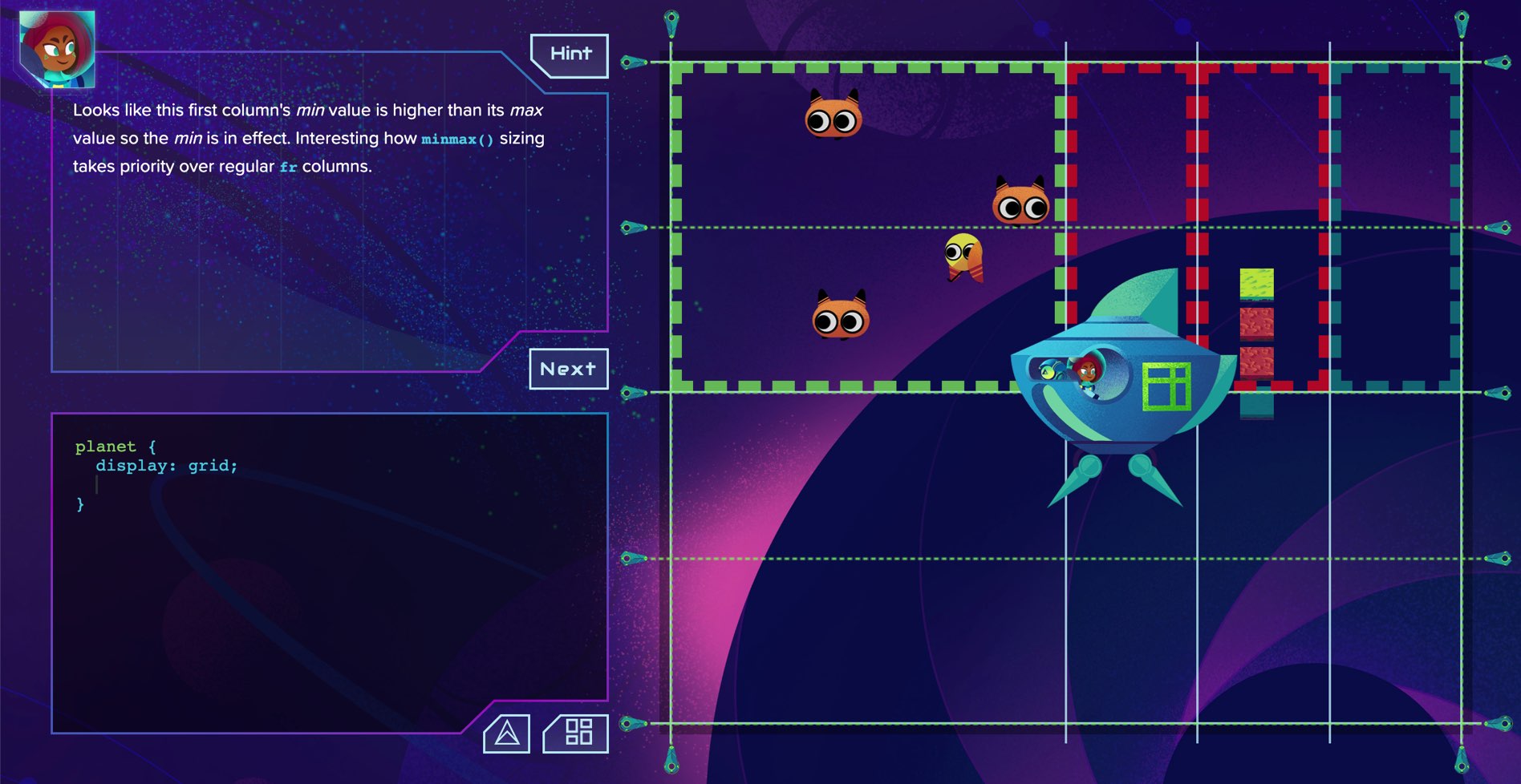
minmax(min, max)
The minmax option lets you create tracks & gaps with flexible size ranges.
.container {
  display: grid;
  grid-template-columns: minmax(auto, 1fr) 1fr;
}
This left column is set to at least the size of its text content, and at most an equal half of the grid's width.
when to use minmax
minmax is one of the most flexible CSS Grid options we have. It's the secret sauce for making awesome tile layouts, article layouts, and more. It's often good to use fr units as the max value to make sure your grid doesn't overflow.
minmax example
This article you're reading right now uses three minmax columns:
  .article {
    display: grid;
    grid-template-columns:
      minmax(1.2rem,1fr) minmax(auto,57ch) minmax(1.2rem,1fr);
  }
repeat
If your Grid has a lot of rows or columns it can be tedious to declare them all. The repeat option is a shortcut for defining the same sized track(s).
.container {
  display: grid;
  grid-template-columns: repeat(4, 1fr);
  grid-column-gap: 10px;
}
The repeat option also lets you define a pattern of tracks that get repeated:
.container {
  display: grid;
  grid-template-columns: repeat(6, 1fr 3fr);
  grid-column-gap: 10px;
}
when to use repeat
Use repeat as a shortcut when you've got a lot of rows or columns. Use it for pattern grids. It's also very good for generative/computed layouts.
Use repeat when you know how much content you'll have in the grid. If you don't know, then you might be better off using implicit tracks (and potentially setting your grid to grow horizontally with grid-auto-flow: column;)
Note that repeat can complicate your named grid lines but as long as you understand the formula for them you'll be fine.
repeat example
I often used CSS Grid to create goal trackers for myself, and repeat definitely comes in handy there. Say you have a goal of drinking a respectable 20 cups of eggnog this season. You can lay down 20 auto columns with repeat in no time.
  .goal {
    display: grid;
    grid-template-columns: repeat(20, auto);
    grid-column-gap: 3px;
    justify-content: start;
  }
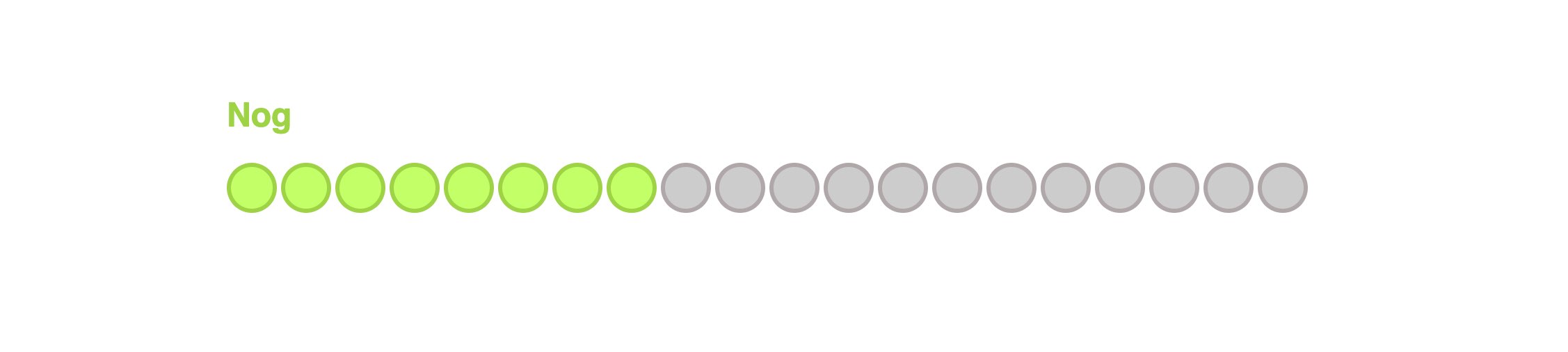
Here's this nog goal css if you actually want to use it :)
Others
There are a handful more units/options out there (e.g. cm, in, pc, pt) but they're either not widely used or don't have great browser support yet (e.g. fit-content).
You've got options
The more Grid layouts you create the more you'll get comfortable using these various units/options. If you want to become an expert at all of this and stop having to constantly look things up then Grid Critters is for you.
Master CSS Grid right from the start by playing this new mastery game. You'll learn the ins and outs of Grids one fun level at a time, while saving an adorable alien life form from certain destruction.Master CSS Grid